
One of the most important things to do with your brand is to build awareness and recognition. There are many ways to do this with unique marketing, but one of the most visceral and easily to manage is in design of logos and posts for your business.
Consumers will respond on both an emotional, as well as intellectual level to a logo or a design that appeals to them. It also is a subconscious reaction – an image that speaks to them connects them to your brand and creates a visual way for them to remember your messaging and company.
Tonight, I’d like to share some insights into how we approach branding and design, and if you want us to take a look and see if we can help with your brand imaging – contact us at Paul@bedfordstmarketing.com.
Pick the right color for your brand image:
Psychology tells us that colors evoke feeling in people. These reactions may be subconscious but different colors make people feel differently. For instance, Red is usually correlated with passion or excitement; Green – money or success; blue – calming, trustworthy. The basic point here is when you are picking the color scheme to use in your logo design or in your marketing media – it is important to be cognizant of what colors you choose and what message you want to send.
For our business, we want to be seen as a trustworthy marketing partner – one that potential clients can feel safe, as well as know that we are their brand ambassadors. Their best interest is our best interest. So, we tend to use a lot of blue in all our images. Sometimes a ligher blue, sometimes a darker more royal blue – but that is one of our base colors. See below for examples of some new logos we are toying with for 2020.
In both instances, we use a calming blue along with a simple “B” icon. Simplicity and trustworthy are the emotions we want to capture here. Keeping the lettering white (or black) is again a way to promote the simplicity. The only time we deviate from the message of simplicity is in our tag line – which we use a script or Architect’s Daughter font. The reasoning is along with a trusty worthy partner and straight forward approach – we bring a innovative and idiosyncratic perspective. The Idiosyncratic is our uniqueness and that is why a more playful or elegant font is important.

Imagery:
The images chosen to represent your brand create an undeniable tie with the consumer. It is our recommendation to use images across the spectrum, but always have a main tonality to the ones the truly define what your brand stands represents.
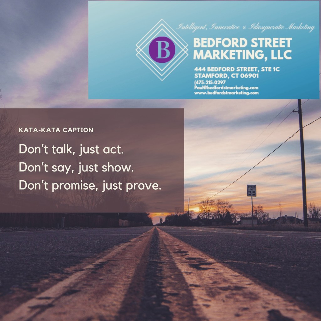
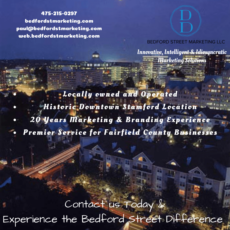
The gallery below is just but an example of the curated content we’ve developed over the last year. Keeping in line with the above idea on color, we always try to incorporate some blue. However the imagery below is varied. In some instances, when the post is more business orientated, we will use a city scene (we are partial to black and white photos of downtown city areas). There is a tone of classiness and professionalism that a city scene evokes in a viewer.
In other instances, when we are posting inspirational messages, we like images of nature or dusk/daybreak. The feeling of lofty goal and ideals is clearly felts in the image of the train bridge in the fog or the mountain top scene. The feeling of innovation and idiosyncrasy is expressed by the lofty imagery.
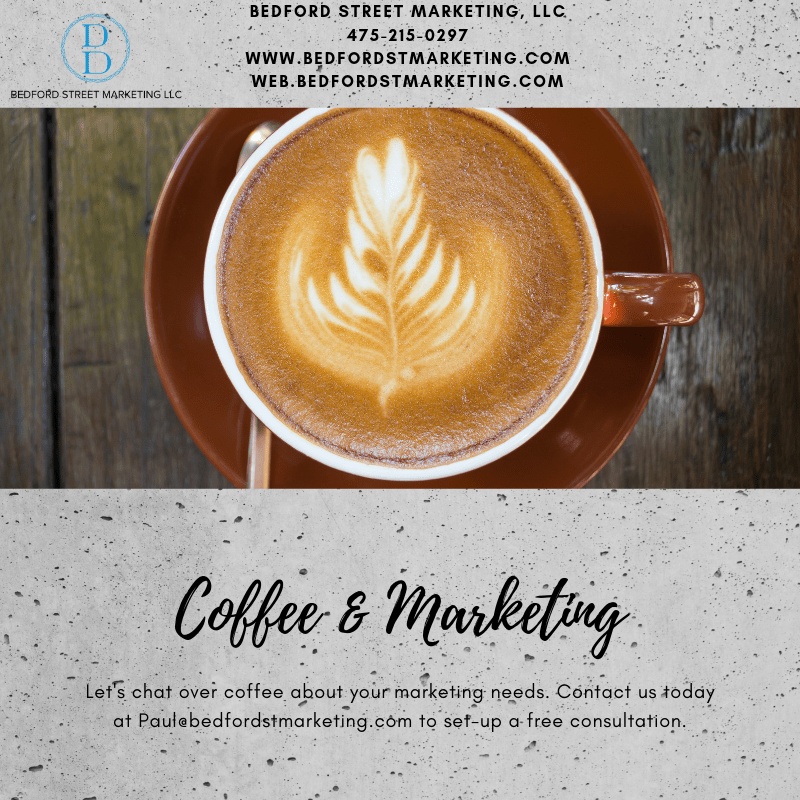
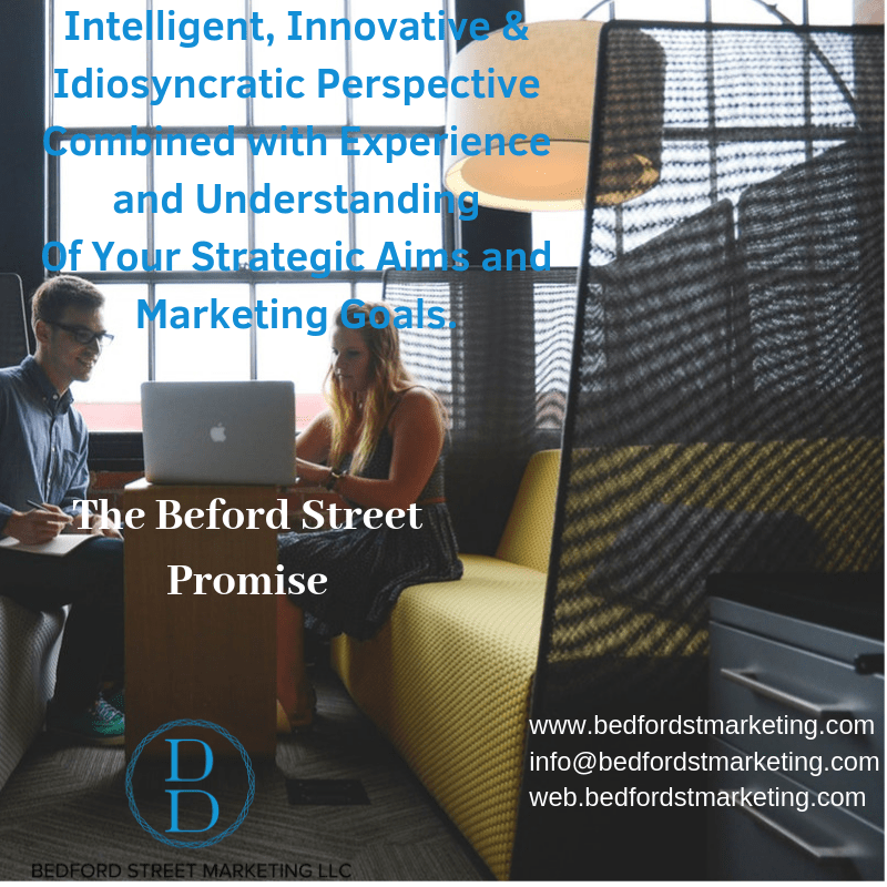
Finally, for the “Coffee and Marketing”, “Promise”, or “Client” posts, we went with images that corresponded with the messaging. Consumers will make the subconscious connection, but picking the perfect image is key to creating the spark for evoking the emotional response.


That’s it for tonight. We’d love to meet up for a coffee and chat about your branding sometime soon.
